Why Color Choice Matters
We underestimate it because it’s everywhere. But color isn’t just wallpaper—it’s a quiet operator that shapes how we feel, move, and think. The red in a dining room can stir appetite. A gray wall in an office might numb motivation. Color tunes us, subtly shifting our gears without saying a word.
It’s not random—there’s psychology behind it. Some colors lift mood; others ground it. Blue makes us feel safe. Yellow nudges the brain into focus. Too much red can amp up stress without us realizing it. Room by room, color choices act like environmental cues: calming our nervous systems in bedrooms, sparking conversation in living areas, or dialing us into work mode at a desk.
Use that knowledge, and color turns into a tool—not just for creating a vibe, but for improving day-to-day life. And in a world built on overstimulation, designing your space with mood in mind isn’t luxury—it’s strategy.
The Basics of Color Psychology
Color isn’t just about aesthetics—it’s a powerful emotional trigger. Choosing the right tones for your space can guide mood, behavior, and even productivity. But before diving into specific shades, it helps to understand the core principles behind how colors are perceived.
Warm vs. Cool Tones
Colors are typically categorized as either warm or cool. Each group evokes different responses depending on intensity, pairing, and context:
Warm tones (like red, orange, and yellow):
– Stimulating and energetic
– Create a sense of warmth and coziness
– Often used in social or active spaces where engagement is key
Cool tones (like blue, green, and purple):
– Calming and soothing
– Help promote focus and clarity
– Better suited for restful or reflective environments
What Common Colors Communicate
Here’s a breakdown of the psychological messaging behind some of the most frequently used colors in interior spaces:
– Blue: Represents calm, trust, and tranquility. Ideal for bedrooms, bathrooms, or offices where relaxation or focus is key.
– Red: Energetic, passionate, and attention-grabbing. Used sparingly, it can add excitement to kitchens, dining rooms, or social zones.
– Green: Symbolizes balance, renewal, and nature. Versatile enough for almost any room, especially living rooms and home offices.
– Yellow: Evokes optimism and mental clarity. Great for kitchens or creative spaces—but best in measured doses.
– Neutrals (white, gray, beige, taupe): Often underrated, they provide stability and flexibility. These shades create clean backdrops for layered color or help balance bolder hues.
Understanding these emotional associations is the first step toward applying color intentionally—setting the tone for every corner of your home.
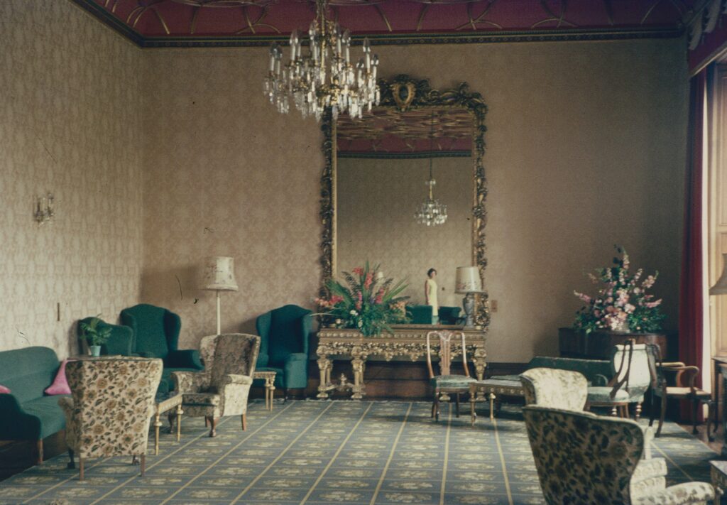
Living Room
The living room is where life gathers—friends, quiet evenings, the occasional movie marathon. Earth tones like soft beige, clay, or muted olive help ground the space and invite people in. If you want calm without cold, lean into soft greens that promote balance and openness without the clinical feel of grays or whites.
Accent walls can do more than look trendy. A deep rust or forest green wall adds depth, anchors furniture placement, and subtly energizes the room. Just one painted wall can shift the whole mood without overwhelming it.
Lighting seals the deal. Natural light plays nicely with organic tones, making textures pop. At night, use warm or dimmable bulbs to soften the room’s edges and keep it cozy. Color sets the base—light brings it to life.
Color and Design Trends: Blending Psychology with Style
2024 is leaning soft and grounded when it comes to color. The bold, saturated tones of previous years are giving way to quiet strength—think stony grays, muted olives, and sun-washed clay. Desaturated palettes and earth-inspired hues are what’s showing up on mood boards and in real homes alike. These aren’t colors that shout. They invite in, slow you down, and make space for living.
It’s all part of a broader shift toward emotive minimalism. “Less color, more intention” doesn’t mean going beige on beige. It means choosing tones that say something, even when they whisper. Designers and DIYers alike are working with a lighter, more thoughtful hand. Every shade has a purpose. Every room speaks—sometimes softly, but always clearly.
Instead of picking what just ‘looks nice,’ homeowners are tuning into how a color makes them feel. Do you need more calm in your workspace? Go dusty blue, not navy. Want energy in your entryway? Maybe it’s a chalky terracotta instead of screaming red. What matters isn’t the trendlist—it’s the alignment between your palette and your purpose.
Want more creative sparks? Check out Modern Home Design Trends to Refresh Your Living Space.
Practical Tips for Getting It Right
Before you commit to any color, put it under some pressure. Don’t guess—test. Swatches look wildly different from morning light to evening shadows. Tape up samples on multiple walls and live with them for a few days. It’s the only way to know how a color actually feels in your space.
Think beyond looks. Color pulls weight. Use it to define how a space works. Calming tones in the bedroom signal rest. Energizing hues near a work station boost focus. Don’t pick paint just because it’s trending—pick it because it supports what you need from the room.
Follow the 60-30-10 rule if balance feels out of reach: 60% dominant color (usually walls), 30% secondary color (furniture or rugs), and 10% accent (pillows, art, trim). It’s a shortcut to harmony without leaning on apps or designers.
Repainting seems like the obvious fix when a room feels off, but sometimes a few accessories can do the job. Swapping throw pillows, adding one bold chair, or integrating artwork can shift the mood without the mess. Don’t repaint until you’ve edited the details first.
Final Takeaway
It comes down to this: your space should serve your mood, not just your Pinterest board. Color is one of the fastest ways to shift how a room feels without tearing down walls or blowing your budget. The smartest design decisions aren’t about price tags—they’re about purpose.
Want calm? Reach for soft blues or gentle greens. Need focus? Hit your workspace with a splash of yellow. Grounded but energized? Earth tones and warm neutrals can do a lot of heavy lifting.
Let how you want to feel be your guide. Once you know that, every palette decision becomes easier. Walls, furniture, accents—all of it starts working together. When color supports emotion, the space clicks. You feel at home. And that’s the goal.
 Joycenie Sumrall is a passionate organic gardening advocate and sustainable agriculture specialist dedicated to helping home gardeners cultivate food and ornamental plants without synthetic chemicals. With over fifteen years of hands-on experience growing vegetables, maintaining fruit trees, and building healthy soil ecosystems, Joycenie brings practical, evidence-based knowledge to every article she contributes to Garden Nation.
Her work focuses on regenerative gardening practices that enhance soil health, support beneficial insects, and create self-sustaining garden ecosystems. Joycenie specializes in organic pest management strategies, companion planting combinations, composting systems, water conservation techniques, and heirloom seed preservation. She is committed to proving that chemical-free gardening is not only possible but often produces healthier plants and more nutritious harvests.
At Garden Nation, Joycenie explores the intersection of environmental stewardship and food production, offering practical guidance on starting raised beds, growing vegetables in small spaces, and maintaining garden fertility through natural methods. Her articles emphasize the importance of understanding soil biology and working with nature rather than against it. She believes that every gardener, regardless of experience level, can adopt organic practices and contribute to a healthier food system.
Joycenie is particularly passionate about urban agriculture and food security, working with local community gardens and educational initiatives to promote sustainable growing practices. She maintains demonstration gardens showcasing different organic methods and regularly conducts workshops teaching proper composting, soil building, and organic pest management. Her mission is to empower gardeners with the knowledge and confidence to grow their own food sustainably and responsibly.
Joycenie Sumrall is a passionate organic gardening advocate and sustainable agriculture specialist dedicated to helping home gardeners cultivate food and ornamental plants without synthetic chemicals. With over fifteen years of hands-on experience growing vegetables, maintaining fruit trees, and building healthy soil ecosystems, Joycenie brings practical, evidence-based knowledge to every article she contributes to Garden Nation.
Her work focuses on regenerative gardening practices that enhance soil health, support beneficial insects, and create self-sustaining garden ecosystems. Joycenie specializes in organic pest management strategies, companion planting combinations, composting systems, water conservation techniques, and heirloom seed preservation. She is committed to proving that chemical-free gardening is not only possible but often produces healthier plants and more nutritious harvests.
At Garden Nation, Joycenie explores the intersection of environmental stewardship and food production, offering practical guidance on starting raised beds, growing vegetables in small spaces, and maintaining garden fertility through natural methods. Her articles emphasize the importance of understanding soil biology and working with nature rather than against it. She believes that every gardener, regardless of experience level, can adopt organic practices and contribute to a healthier food system.
Joycenie is particularly passionate about urban agriculture and food security, working with local community gardens and educational initiatives to promote sustainable growing practices. She maintains demonstration gardens showcasing different organic methods and regularly conducts workshops teaching proper composting, soil building, and organic pest management. Her mission is to empower gardeners with the knowledge and confidence to grow their own food sustainably and responsibly.